

J&C Hendrick
Ireland’s leading provider of customer centric solutions
-
The Issues:
Outdated brand and website
Lack of visual appeal and differentiation from competitors
Ineffective communication of the business's strengths to customers
Intensifying competition in the market
Inconsistency in brand elements and messaging.
-
What we worked on:
Brand strategy development, including the establishment of brand values, personality, tone of voice, and other essential elements to effectively connect with their target audience.
Brand visuals development, including the creation of a distinctive brand identity that would differentiate the business from competitors and position them for future growth.
Website design and development, with a focus on effectively communicating the business's services and presenting a professional image to potential customers.
-
Results:
A strong and distinctive brand identity that sets them apart from competitors.
A clear and consistent brand message across all channels.
A website that effectively communicates their services and presents a professional image to potential customers.
Increased visibility and recognition in the market.
Improved customer engagement and loyalty.
Greater potential for future growth and success.


-
The Brief.
J&C Hendrick is Ireland’s leading customer management solutions provider improving user experiences in the financial, healthcare, retail and public services sectors. Their work can be seen throughout Ireland in locations such as Government Departments, County Councils, Post Offices, Hospitals, TKMaxx, Arnotts, and Dublin & Cork Airport.
They support and provide clients with innovative, premium and reliable solutions that enable them to deliver exceptionally positive customer journey experiences.
In order to convey their significant business growth and elevate their brand to reflect the high quality of their work, a comprehensive rebranding was deemed necessary to commemorate their 50 years in business.
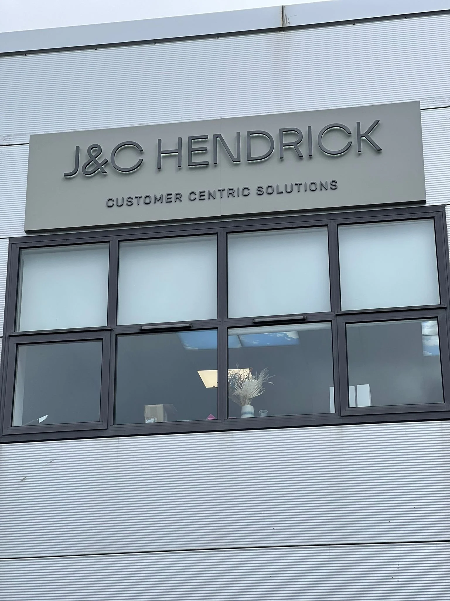
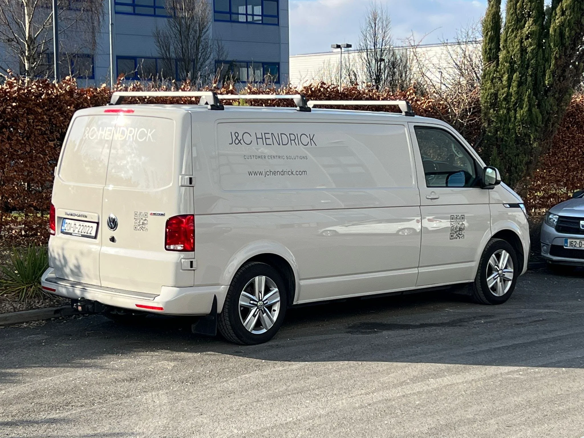
This also included a new website, company van design and office signage.
-
The Result.
This brand drew heavy inspiration from architecture, taking cues from the industry and analysing building plans, layouts, and pathways that people take. It was crucial to convey a sense of structure and organisation while eliminating chaos for clients. By utilising minimal space, we were able to display confidence in the brand.
The overall design is professional and clean, with a simple and modern yet alternative Geo Sans Serif font. Throughout the branding, there are subtle tech elements that underscore the brand's underlying technological sophistication.
“As soon as we had the discovery call I engaged my trust which is very rare for me.”
— Gavin Heffernan, J&C Hendrick
Before working with Olwyn, I wasn’t confident in our brand. She previously completed a professional result for my wife’s company which made me want to work with her. Olwyn was hugely supportive, very professional and was not afraid to ask questions.
I felt confident in allowing Olwyn to show me the new direction instead of my traditional methods which I would want to be very involved. I would suggest be transparent with Olwyn on the flaws and weakness you have in your business brand. The open transparency I fell has allowed us to achieve the best result. i have no hesitation in recommending her services to others.